
Grid 與 Flex 布局有一定的相似性,但是功能更加強大,學習起來也有不少難度,不過相信下面的內容會幫你更快的掌握 Grid。 1. 官方定義通過設置 display: grid; 可以定義一個 CSS 網格。然后使用 grid-template-rows 和 grid-template-columns 屬性來定義網格的 columns 和 rows。 2. 解釋Grid 是一個二維網格布局,它有行 grid-template-rows (橫排)、 列 grid-template-columns(豎排),內部的項目就分布在其中,而網格線就是行和列劃分出來的。 基本屬于解釋: 容器:上面代碼中,最外層的<div>元素demo就是容器。 3. 語法
.demo{
    display:grid
}
.demo{
    display:inline-grid;
}
容器包含屬性如下
grid-template 是 grid-template-columns 、grid-template-rows、 grid-template-areas 縮寫。 grid 是 grid-template-rows、grid-template-columns、grid-template-areas、 grid-auto-rows、grid-auto-columns、grid-auto-flow的合并縮寫。 提示:gird 屬性很復雜因此不推薦 grid 的縮寫 項目包含屬性介紹
4. 兼容性
5. 實例本小節暫時不對父容器和子容器內的屬性進行詳細的實例使用展示,僅對 display 屬性進行效果區分,可以從下一小節開始其他內容的學習。
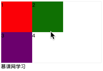
<div class="demo">
    <div class="item">1</div>
    <div class="item">2</div>
    <div class="item">3</div>
    <div class="item">4</div>
</div>
通過下面的設置: .demo{
display: grid;
grid-template-columns:px px;
grid-template-rows:px px;
border:px solid #eee
}
.item:nth-of-type(1){
background: red;
}
.item:nth-of-type(2){
background: green;
}
.item:nth-of-type(3){
background: purple;
}效果圖
<!DOCTYPE html>
<html lang="en">
<head>
<Meta charset="UTF-8">
<Meta name="viewport" content="width=device-width, initial-scale=1.0">
<title>Document</title>
<style>
.demo{
    display: grid;
    grid-template-columns:px px;
    grid-template-rows:px px;
    border:px solid #eee
}
.item:nth-of-type(1){
    background: red;
}
.item:nth-of-type(2){
    background: green;
}
.item:nth-of-type(3){
    background: purple;
}
</style>
</head>
<body>
<div class="demo">
    <div class="item">1</div>
    <div class="item">2</div>
    <div class="item">3</div>
    <div class="item">4</div>
</div>
網學習
</body>
</html>
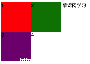
<div class="demo"> <div class="item">1</div> <div class="item">2</div> <div class="item">3</div> <div class="item">4</div> </div> 網學習 .demo{
display: inline-grid;
grid-template-columns:px px;
grid-template-rows:px px;
border:px solid #eee
}
.item:nth-of-type(1){
background: red;
}
.item:nth-of-type(2){
background: green;
}
.item:nth-of-type(3){
background: purple;
}效果圖
<!DOCTYPE html>
<html lang="en">
<head>
<Meta charset="UTF-8">
<Meta name="viewport" content="width=device-width, initial-scale=1.0">
<title>Document</title>
<style>
.demo{
    display: inline-grid;
    grid-template-columns:px px;
    grid-template-rows:px px;
    border:px solid #eee
}
.item:nth-of-type(1){
    background: red;
}
.item:nth-of-type(2){
    background: green;
}
.item:nth-of-type(3){
    background: purple;
}
</style>
</head>
<body>
<div class="demo">
<div class="item">1</div>
<div class="item">2</div>
<div class="item">3</div>
<div class="item">4</div>
</div>
網學習
</body>
</html>6. 小結
|