
flex-wrap 換行flex-wrap 主要通過在外層容器中設置它里面的子項目是否可以換行。默認情況下項目是不換行的。 1. 官方定義flex-wrap 屬性規定flex容器是單行或者多行,同時橫軸的方向決定了新行堆疊的方向。 2. 解釋默認情況下,設置了 display:flex 的容器是不會換行的,這時候如果我們希望它換行就可以通過 flex-wrap設置超出寬度換行,也可以設置它如何換行,既換行之后的排列的方向。 3. 語法flex-wrap: Nowrap|wrap|wrap-reverse|initial|inherit; 屬性值
4. 兼容性
5. 實例
.demo{
display: flex;
flex-wrap: wrap;
}
.item{
width: px;
height: px;
line-height: px;
background: #ccc;
border-right: px solid #fff;
text-align: center;
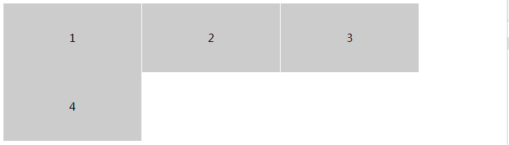
}效果圖
<!DOCTYPE html>
<html lang="en">
<head>
    <Meta charset="UTF-8">
    <Meta name="viewport" content="width=device-width, initial-scale=1.0">
    <title>Document</title>
    <style>
        .demo{
            display: flex;
            flex-wrap: wrap;
        }
        .item{
            width: px;
            height: px;
            line-height: px;
            background: #ccc;
            border-right: px solid #fff;
            text-align: center;
        }
    </style>
</head>
<body>
    <div class="demo">
        <div class="item">1</div>
        <div class="item">2</div>
        <div class="item">3</div>
        <div class="item">4</div>
    </div>
</body>
</html>
.demo{
display: flex;
flex-wrap: wrap-reverse;
}
.item{
width: px;
height: px;
line-height: px;
background: #ccc;
border-right: px solid #fff;
text-align: center;
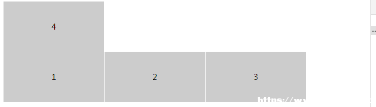
}效果圖
<!DOCTYPE html>
<html lang="en">
<head>
    <Meta charset="UTF-8">
    <Meta name="viewport" content="width=device-width, initial-scale=1.0">
    <title>Document</title>
    <style>
        .demo{
            display: flex;
            flex-wrap: wrap-reverse;
        }
        .item{
            width: px;
            height: px;
            line-height: px;
            background: #ccc;
            border-right: px solid #fff;
            text-align: center;
        }
    </style>
</head>
<body>
    <div class="demo">
        <div class="item">1</div>
        <div class="item">2</div>
        <div class="item">3</div>
        <div class="item">4</div>
    </div>
</body>
</html>
6. 小結flex 彈性盒模型默認是不換行的既 Nowrap |